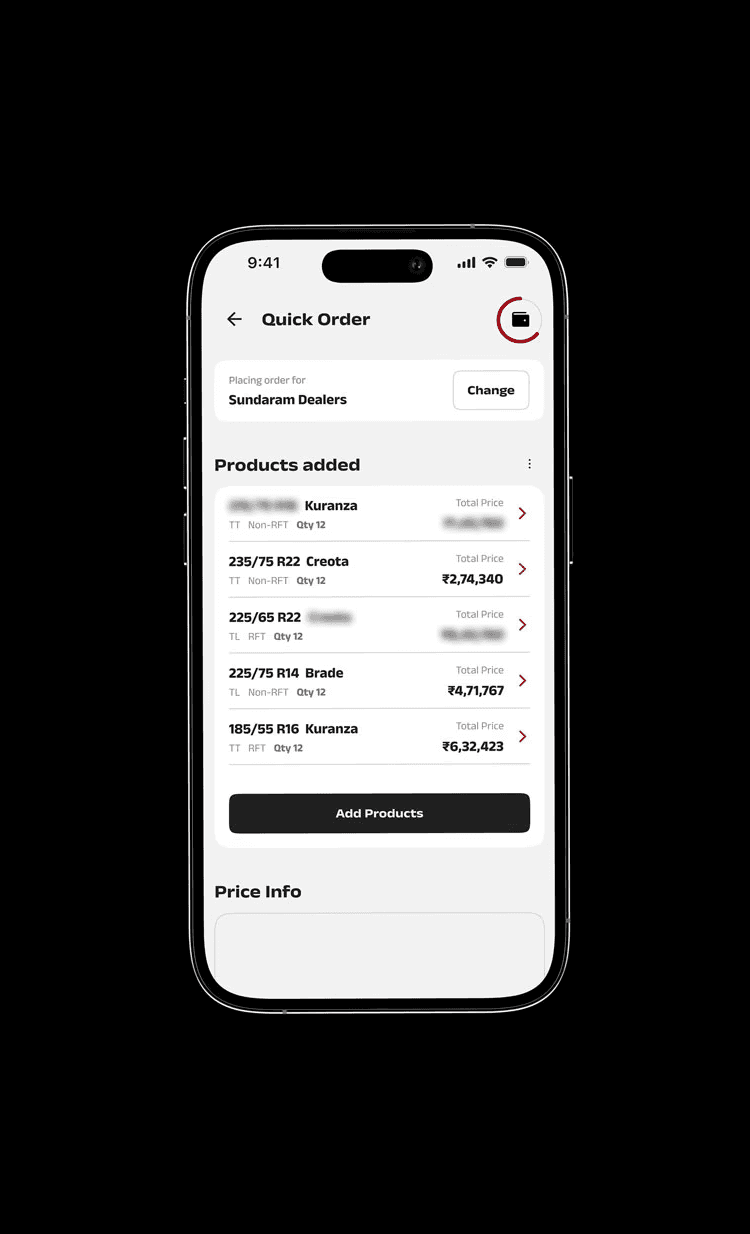
Reducing the time and manual effort dealers spend replicating their to-order list into the system.
Design Timeline
12 weeks (Sept'23 - Dec'23)
Team
3 UXDs + PM + UXR
My Role
Senior Product Designer
Research Synthesis, Design System, UX, Visual Design, Interaction Design, Prototypes & Hand-off


26% increase in average order value
+42 NPS increase among high-frequency dealers
38% fewer input errors
Redundant Manual Entry
Dealers found the process redundant—especially for those placing repeat or bulk orders.
Added Frustration
Omissions & Second Thoughts
Dealers often had second thoughts while adding certain line items and mostly omit.
Reduced Average Order Value
Long ordering sessions
B2B dealers, often multitasking, are prone to get distracted leads to high returns, inventory mismatches, and additional operational overhead.
Increased operational cost
Scenario 1
Owner-driven Ordering
Scenario 2
Employee-driven Inventory, Owner Places Orders
Hand written notes
Text messages
Excel
Phone calls (owner notes it down manually)
Hand written notes
WhatsApp (text, audio, or images of notes)
Text messages
Audio files
Image
Hand written notes
Text messages
Excel
Audio files
Image
01
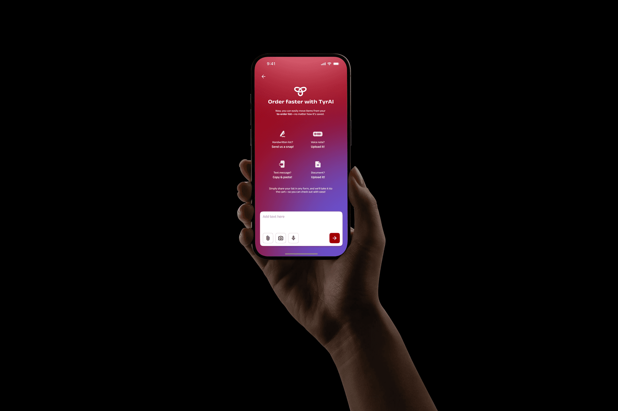
Handwritten Texts/ Screen shots/ Excel sheets/ Images
Leveraging AI-based Optical Character Recognition (OCR) models like Google Cloud Vision, Microsoft Azure Computer Vision, AWS Textract, and Tesseract OCR helps in identifying the requirement list from Handwritten texts
It goes beyond simple character detection—they use deep learning models (such as convolutional neural networks, or CNNs) to improve accuracy, even in messy handwriting or poor-quality images.
02
Audio files
Automatic Speech Recognition (ASR) models like Google Cloud Speech-to-Text, AWS Transcribe, OpenAI Whisper helps in identifying the requirement list from audio files.
These AI models can differentiate between accents, background noise, and even understand context
03
Text messages
Text messages can be easily copy pasted with access to clipboard.

Placing a visually distinct and prominent call-to-action (CTA) button within comfortable thumb reach increases accessibility but also supports higher engagement and adoption rates

Providing a concise, contextual explanation of how the feature works can significantly improve onboarding and feature adoption.
For new users, it serves as a helpful introduction, reducing friction and building confidence. For returning users, it acts as a quick refresher, reinforcing their understanding and encouraging continued use. This small addition supports a smoother, more inclusive experience for users at varying levels of familiarity.


Similar Inputs
Example: Upload image + Capture ImageDifferent inputs
Example: Upload image + Add text/ Record a voice note/ Upload a document
Let's assume 70% of dealers tend to use Similar Inputs.

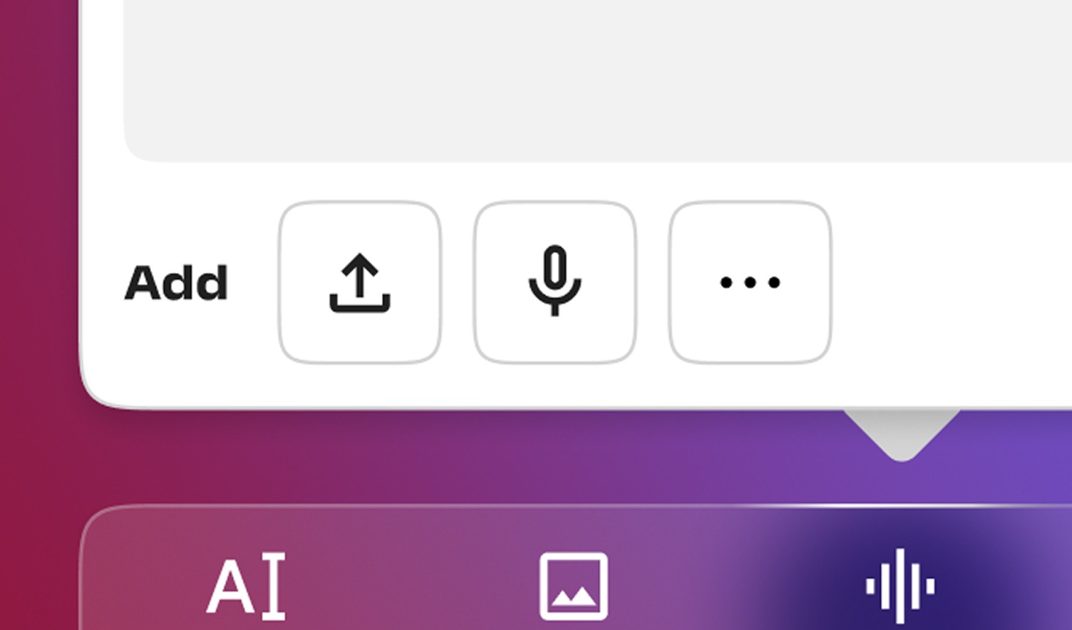
The dealers can easily add another input here. With earlier assumption, I have kept Similar Inputs upfront and Different Inputs nested.

User testing proved us wrong!
User testing revealed more nuanced needs—such as combining text with images or adding a document for clarification—it became clear that the system needed to adapt to multi-input scenarios more fluidly.
This insight challenged our initial assumption and led to a key design shift:
We introduced a customized input layout that surfaces the two most frequently used input types per user upfront, while nesting the remaining options under an expandable menu. This made the interface feel more personalized and efficient, improving overall usability and speed of interaction.

26% increase in average order value
+42 NPS increase among high-frequency dealers
38% reduction in the operational cost
Start with user behavior, not the tech
AI is most useful when it removes friction—not when it adds a new layer of interaction.
We observed how dealers already operated—jotting down lists, taking photos, sending messages—and designed AI to meet them where they are.
This shift in mindset ensured that AI wasn’t a novelty or an obstacle—it was a natural extension of how they were already working.
Familiar ≠ Functional
Starting with interaction patterns from familiar apps like ChatGPT and WhatsApp helped reduce the learning curve, but user needs in this context were significantly different. Realizing this early helped avoid forcing an unsuitable pattern.
Assumptions need validation—context is everything
The assumption that users would interact with all input types equally was challenged during testing. Tailoring the UI to surface the most-used inputs based on user behavior made the experience more efficient and personalized.
Flexibility in design increases adoption
Designing for either/or input types evolved into allowing users to combine multiple inputs, giving them the flexibility to communicate complex orders more naturally.
Smart automation improves efficiency—but needs human fallback
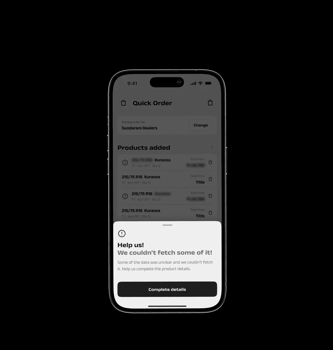
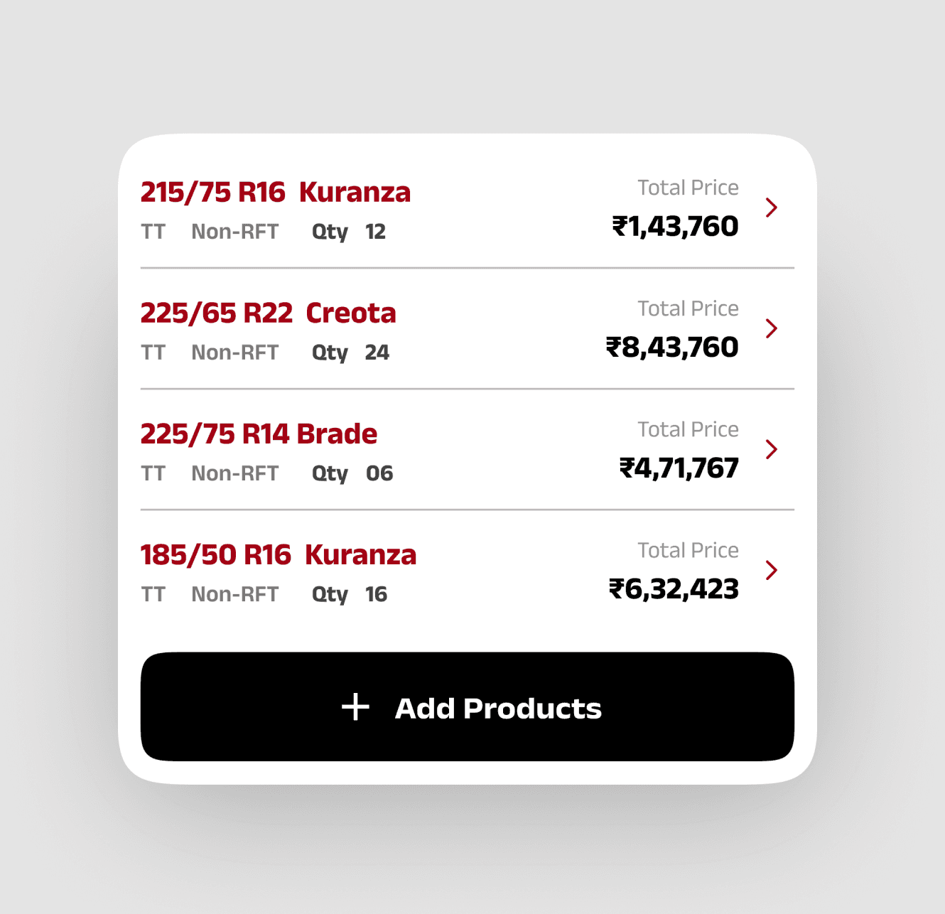
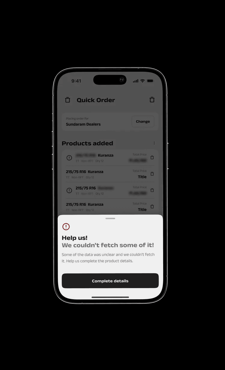
Automatically mapping user inputs to inventory streamlined the process, but including checkpoints for unclear data ensured reliability. Prompting user intervention where needed created a more robust system.
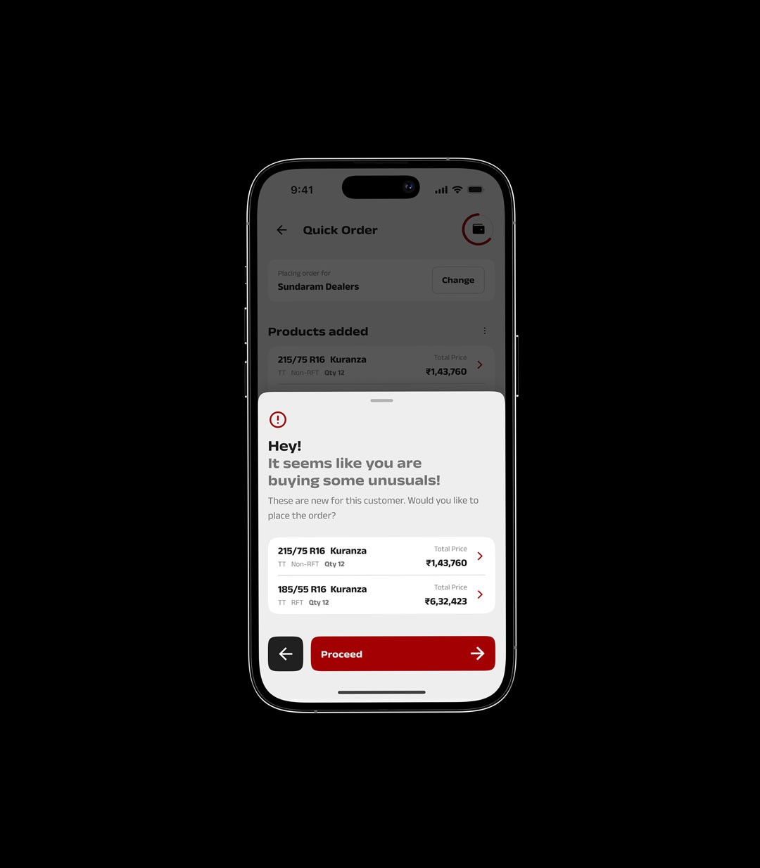
Micro-interventions can prevent macro-errors
The anomaly detection at checkout served as a subtle, intelligent safety net—helping users catch mistakes before they happen, improving trust and reducing returns.

