Redesigning the digital sales order tool to streamline the experience, reduce friction for vendors, and accelerate order fulfillment.
Design Timeline
8 weeks (May'24 - Jul'24)
Team
3 UXDs + PM + 2UXR
My Role
Senior Product Designer
UX audit, Research Synthesis, UX, Visual Design, Interaction Design, Prototypes & Hand-off

For an FMCG manufacturer aiming to boost sales revenue, delays in vendor-to-retailer transactions were proving costly. The company identified that inefficiencies in their sales order creation flow were leading to:
I was tasked with redesigning the digital sales order tool to streamline the experience, reduce friction for vendors, and accelerate order fulfillment.
A sales order is a formal confirmation of goods or services to be delivered. For FMCG companies, speed and accuracy are crucial. However, a usability analysis revealed:
32% of retailers reported delays in receiving sales orders from vendors
26% of vendors found the current tool difficult to use
These inefficiencies pointed toward a breakdown in the digital ordering experience, directly impacting product availability and revenue.
UX Audit
Understanding the Userflow
Approach & Redesign Strategy
With a clear understanding of the pain points and user flow mapped, I set out to redesign the sales order creation experience from the ground up. My goal was to reduce friction, enhance clarity, and guide users through the process with greater ease and confidence. To achieve this, I introduced key design interventions across the interface:
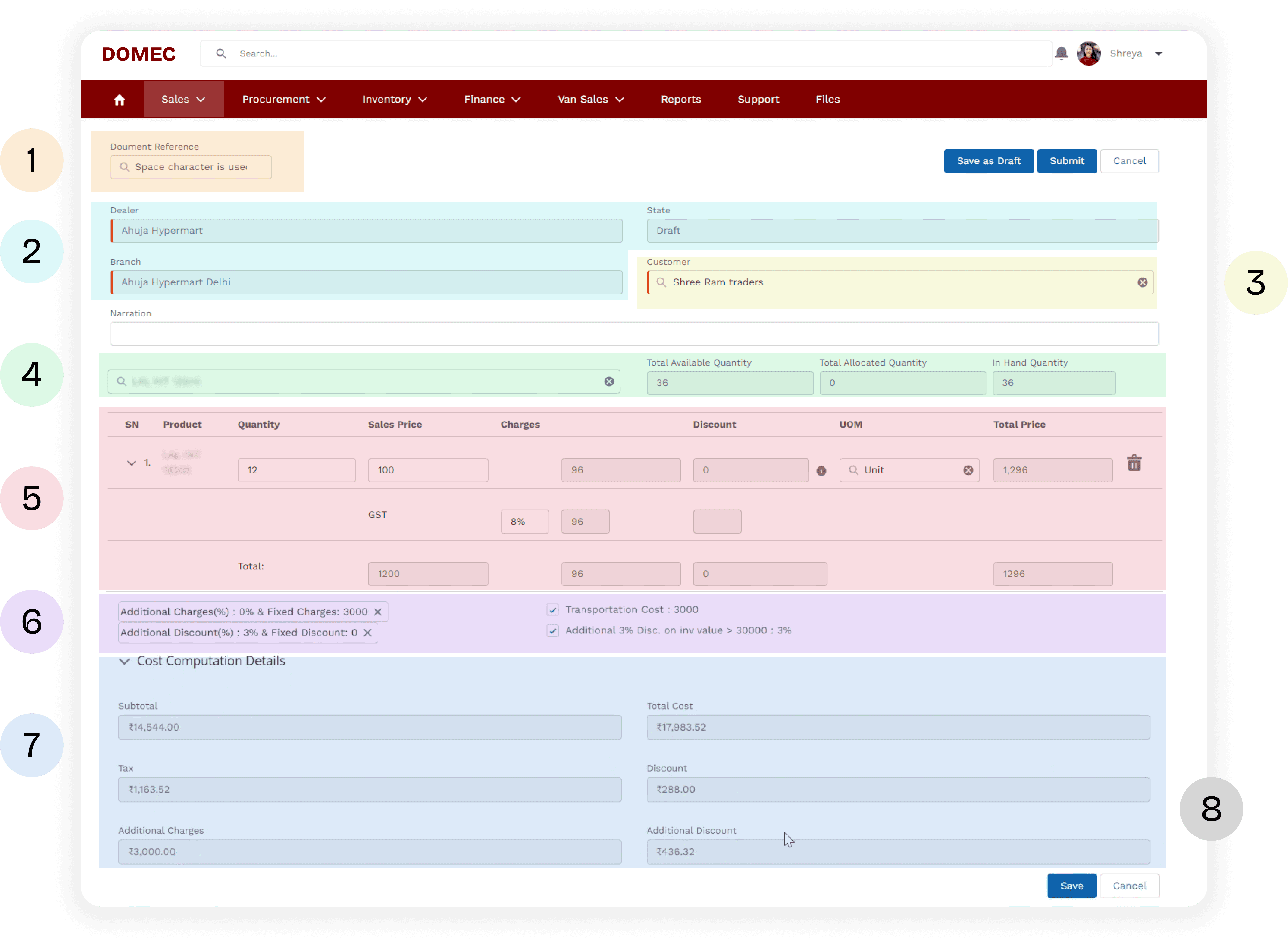
Clarity through Structure
I reorganized the layout by grouping related inputs into well-defined sections, each introduced with clear headers. This modular approach helped break the long, dense form into manageable parts, making it easier for users to scan, comprehend, and complete.
Efficiency by Reducing Redundancy
System-generated information such as Dealer Name, Branch, and Order Status were converted to read-only fields. This minimized unnecessary interactions and eliminated confusion around what the user was expected to fill in — helping streamline the form completion time.
Streamlined Inputs
Wherever possible, I removed unnecessary input fields and only surfaced editable components. For example, in the product list, only quantity could be modified — so all other pricing fields were displayed as static values. This not only simplified the interface but also reduced decision fatigue and improved focus.
Improved Visual Hierarchy
I applied principles of visual design — such as spacing, color, typography, and contrast — to highlight primary actions and key inputs. This guided the user’s attention to what mattered most, especially in high-density areas like product selection and price summary.
Contextual Guidance
To reduce guesswork and hesitation, I introduced microcopy and tooltips throughout the flow. These subtle cues helped differentiate optional steps (e.g., applying a quote ID or customizing discounts) from mandatory ones, improving task clarity and reducing errors.
Final Design
Key Interaction Enhancements
A significant portion of the redesign focused on optimizing how vendors add products, manage inventory visibility, and apply charges or discounts — all while minimizing friction and reducing unnecessary cognitive load.
1. Clarifying Optional Quote Details
Old

The Quote ID field lacked clarity, appearing as just another input field — with no indication that it was optional. Despite its strategic importance to the business, the placement and design often led users to overlook it.
Redesign v2

To improve this, I introduced a distinct visual treatment using color and iconography, making the quote option more noticeable yet clearly distinguishable
But through stakeholder discussions and usage analysis, a new insight emerged: Only 27% of users leveraged quote-based ordering, while the majority (73%) used the "Search & Add" method. Initially, this made me question the need to give the quote feature high visibility.
This led to a critical design tension: How do we promote an underutilized but valuable feature without compromising the primary flow?
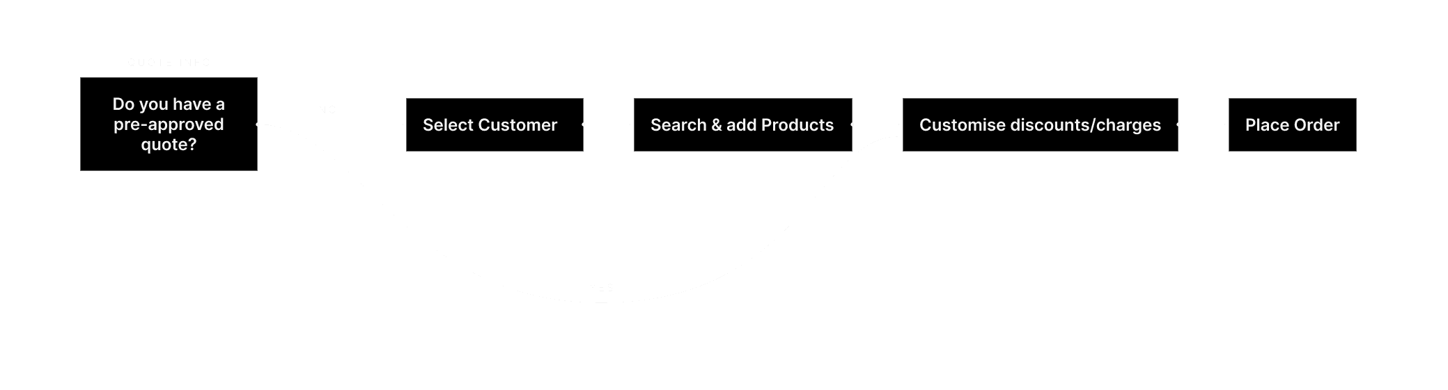
Although I wasn’t initially convinced that increased emphasis was the solution, the business team was keen on driving adoption of quote-based ordering. To address both needs, I proposed a smart entry-point intervention:
Redesign v2
1

A one-time pop-up at the start of the flow prompts users to enter their Quote ID. If provided, they’re taken directly to a pre-filled order summary, saving time
2

If skipped or dismissed, the user continues the standard flow — with the ability to recall the quote pop-up anytime from a clearly placed action button
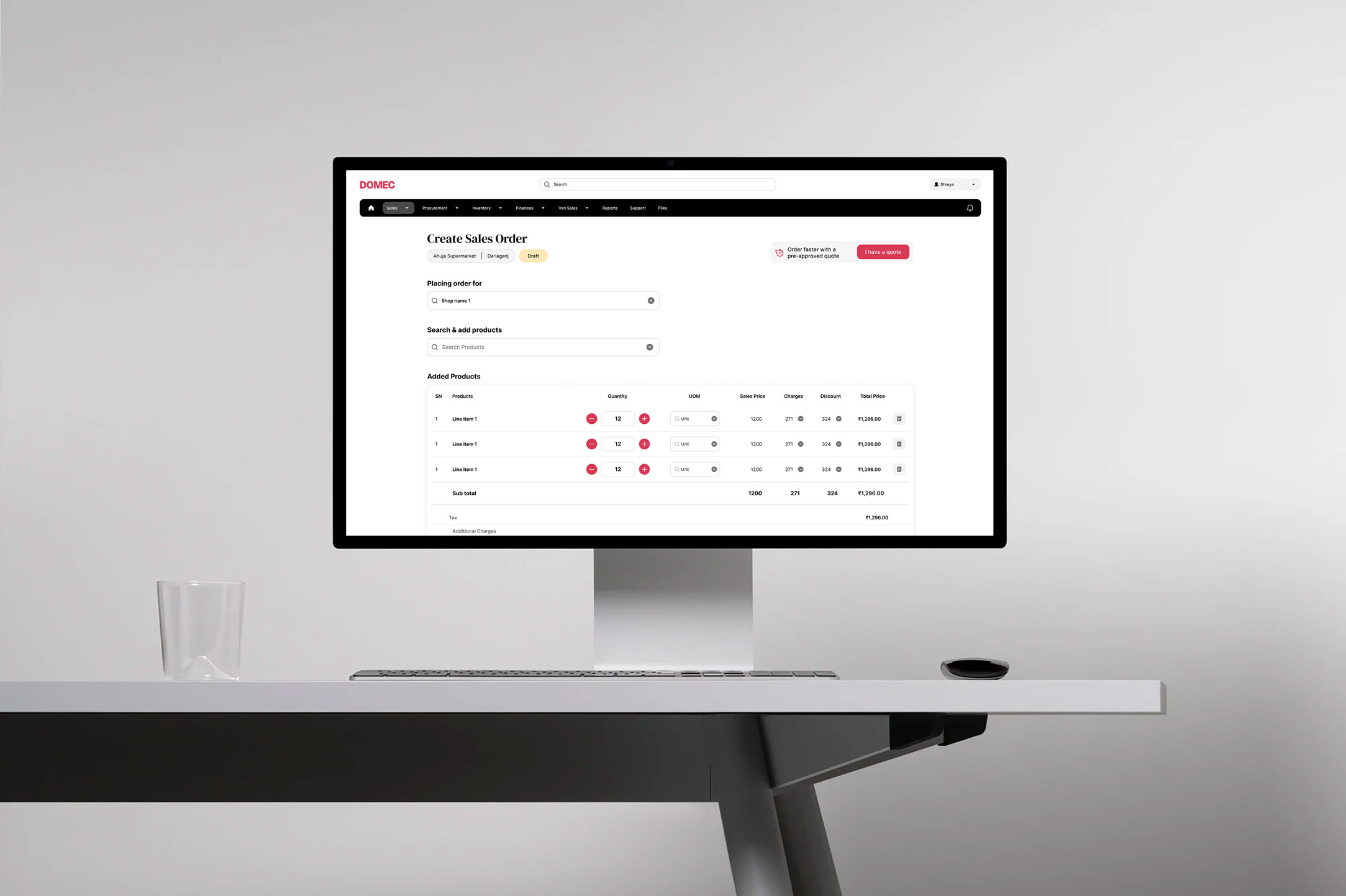
1. Product Search & Add Flow
Old

The previous flow treated product search as a basic input field with limited feedback.
Redesign v1
I redesigned the product search interaction as a context-aware suggestive search, showing:
Auto-complete suggestions based on product name/code
Real-time stock availability alongside each suggestion
This allowed vendors to make faster, informed decisions without jumping between systems or sections.
Once a product was selected, it was automatically added to the ‘Added Products’ section, where users could continue adding more items or adjust quantities.
2. Contextual Inventory Visibility
Old

Inventory check data was visible as a fixed field, even before the product was selected — irrelevant and distracting during early stages.
Redesign v1
I introduced a just-in-time inventory check. Now, when a user selects a product and is about to input quantity, the system displays the available stock dynamically next to the quantity field.
This ensured:
Inventory info appeared exactly when needed
Reduced unnecessary mental effort in parsing unrelated stock data
Lowered chances of input errors and order rejections due to stockouts
This shift helped maintain focus and reduced screen clutter, especially useful for high-volume order scenarios.
3. Adding Charges and Discounts with Clarity
Old

The ability for sellers to add charges and discounts was available, but it was buried in a different, complex layout. Additionally, the same information was repeated in the price breakdown section, causing unnecessary confusion for the user.
Redesign v1
I streamlined this process by integrating charges and discounts directly into the price breakdown section. This change allowed sellers to:
Add or remove charges and discounts easily within the same section
See real-time updates of how these adjustments affected the total order price
Review the final price breakdown in a single, coherent view without redundancy
This consolidation not only reduced cognitive load but also gave sellers the confidence that they were making adjustments with full visibility into their financial impact.
Task success rates improved by 30%
More users were able to successfully place a sales order on their first attempt, without external help or support.
Design clarity is business-critical
Even a seemingly “functional” tool can hinder growth if it lacks intuitive structure and guidance. Simplicity and clarity aren’t nice-to-haves — they’re key drivers of user adoption.
Design for optionality, not assumption
Just because a feature is useful doesn’t mean it should dominate. The quote flow intervention struck a balance — making it visible without forcing it.
Context is the best assistant
Providing information exactly when users need it (e.g., inventory while entering quantity) reduced decision fatigue and improved accuracy.
By focusing on clarity, contextual guidance, and reduced friction, we were able to transform a clunky enterprise tool into a more intuitive, user-friendly experience — one that helped bridge the gap between vendor intention and retailer fulfillment.

