B2B

B2B

Mobile

Mobile

Quick Ordering made quicker!

Reducing the ordering time
by 40%

Redesigning the Quick Order flow for dealers in a B2B platform—where speed, accuracy, and control are key to everyday operations.

Design Timeline
12 weeks (Sept'23 - Dec'23)

Team
3 UXDs + PM + UXR

My Role
Senior Product Designer
Research Synthesis, Design System, UX, Visual Design, Interaction Design, Prototypes & Hand-off

Disclaimer
While I might not be able to disclose specific details of these projects I had worked on, I will try to demonstrate the thought process and design decisions I took a long the way with an hypothetical use case.

Disclaimer
While I might not be able to disclose specific details of these projects I had worked on, I will try to demonstrate the thought process and design decisions I took a long the way with an hypothetical use case.

Project Summary
Project Summary

Problem

Problem

How might we streamline the ordering process for dealers who are deeply familiar with the product catalog and arrive with a pre-defined "to-order list"?

Final Outcome

Final Outcome

A simple, single-page ordering flow designed to reflect real-world user behavior—building and finalizing a list step by step.

Sneak Peak

Sneak Peak

Impact

Impact

26%

26%

reduction in time taken to place an average bulk order

reduction in time taken to place an average bulk order

47% increase in Saved Order usage after making it more visible and integrated

+38 NPS score for the Quick Order flow (compared to -4 in the previous version)

Fewer support queries related to repeat orders and credit info

Context
Context

To efficiently manage their inventory, dealers handling a wide range of products often need to promptly order specific items. This is a critical aspect of their day-to-day business activities.

To efficiently manage their inventory, dealers handling a wide range of products often need to promptly order specific items. This is a critical aspect of their day-to-day business activities.

Unlike the customers of business-to-consumer (B2C) sites—who tend to purchase in smaller quantities and at irregular intervals business-to-business (B2B) customers frequently order in bulk and place repeat orders as part of their routine operations.

Unlike the customers of business-to-consumer (B2C) sites—who tend to purchase in smaller quantities and at irregular intervals business-to-business (B2B) customers frequently order in bulk and place repeat orders as part of their routine operations.

These customers usually know exactly what they need. Rather than browsing or discovering new products, they often arrive with a predefined “to-order” list, which they aim to replicate and fulfill as quickly as possible.

These customers usually know exactly what they need. Rather than browsing or discovering new products, they often arrive with a predefined “to-order” list, which they aim to replicate and fulfill as quickly as possible.

This behavior led us to define a dedicated Quick Order flow—an experience optimized for speed, familiarity, and efficiency.

This behavior led us to define a dedicated Quick Order flow—an experience optimized for speed, familiarity, and efficiency.

The Problem
The Problem

The standard e-commerce flow typically follows three steps:

The standard e-commerce flow typically follows three steps:

1

Identifying products

2

Adding them to the cart

2

3

Proceeding to checkout

3

While this works well for most users, it introduces unnecessary friction for B2B dealers who already know what they need. The challenge was:

While this works well for most users, it introduces unnecessary friction for B2B dealers who already know what they need. The challenge was:

How might we streamline the ordering process for dealers who are deeply familiar with the product catalog and arrive with a pre-defined shopping list?
Approach
Approach

We began by examining the first step: Identifying products. For a Quick Order flow, we needed to ensure that product lookup was as fast and precise as possible

We began by examining the first step: Identifying products. For a Quick Order flow, we needed to ensure that product lookup was as fast and precise as possible

We prioritized Search & Add as the primary interaction model for this flow. With search being the central entry point, the focus shifted to speed, autocomplete accuracy, and intelligent filtering.

We prioritized Search & Add as the primary interaction model for this flow. With search being the central entry point, the focus shifted to speed, autocomplete accuracy, and intelligent filtering.

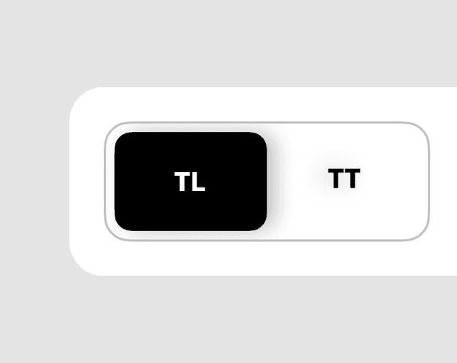
Lets analyze the naming of tires

Dealer primarily recognizes the tires by the size,
with the exact variables makes the complete
identification of a particular product.

Dealer primarily recognizes the tires by the size, with the exact variables makes the complete
identification of a particular product.

Dealer primarily recognizes the tires by the size, with the exact variables makes the complete identification of a particular product.

Since the product names were often long and complex, we explored breaking them down into their core identifying components—such as size, pattern, and specifications—to help users locate them faster.

Since the product names were often long and complex, we explored breaking them down into their core identifying components—such as size, pattern, and specifications—to help users locate them faster.

With the core behavior and user needs clearly defined, I began exploring the interaction design possibilities — how quickly items can be added to the cart, and how we can help users stay in flow throughout the experience.
Analyzing the existing

On analysing the exisitng flow, I discovered a pattern were:

On analysing the exisitng flow, I discovered a pattern were:

Each product was represented as a card, and every time a new item was added, a new card appeared at the bottom of the list.

Cognitive Load

As more cards were added, users were required to scroll and visually scan through multiple product modules. This made it increasingly difficult to:

  • Keep track of what had already been added

  • Compare product details quickly

  • Spot missing or duplicate entries

The vertical stacking of detailed cards began to feel cluttered, especially on smaller screens or devices with limited vertical space. Information fragmentation and vertical scroll fatigue were potential risks.

Building on the existing - Single Card with Cart

I stared exploring the possibility of arriving at a solution based on the existing pattern. The goal was to reduce development effort while still delivering a high-impact solution.

I stared exploring the possibility of arriving at a solution based on the existing pattern. The goal was to reduce development effort while still delivering a high-impact solution.

Based on learnings from the earlier version, we moved toward a minimalist approach to reduce visual clutter and cognitive load. In this iteration, we limited the interface to a single, reusable product input card.

Based on learnings from the earlier version, we moved toward a minimalist approach to reduce visual clutter and cognitive load. In this iteration, we limited the interface to a single, reusable product input card.

Simplifying Iteration 1..

Simplifying Iteration 1..

One Card, One Action
Dealers could search and add one product at a time. Once added, the product moved to the cart, clearing the card for the next input.

Separation of Concerns
To streamline the UI, we removed quantity and price details from the input card and moved them to the cart review page.

Centralized Review
All added products were consolidated in the cart, where dealers could review the complete list, check quantities, view a price breakdown, and proceed to checkout.

1

1

1

2

2

2

3

3

3

4

4

4

5

5

5

While this approach offered a quick implementation path, I needed to assess its usability—particularly for our B2B audience. So, we took this to users.

1

Adding product were cumbersome

34% of users found the product entry screen confusing.

The complexity stemmed from multiple dropdowns and toggles within the card, which created decision fatigue during a task that users expected to be fast and straightforward.

2

Frequent Cart Check

60% of users regularly opened the cart mid-way through ordering.

Why? To avoid duplicate orders. Users lacked visual confirmation of what was already added, which disrupted their flow.

3

Saved Orders Were Often Missed

68% of users didn’t notice the existing “Saved Orders” feature.

However, 84% responded positively to the idea of integrating Saved Orders within the Quick Order experience.

4

Credit info at the check out

One user explicitly asked to see credit information (e.g., credit limit, outstanding dues) at the time of checkout

When asked, most users reacted positively—highlighting how financial context helps them make faster purchasing decisions.

Given these findings, I decided to pivot away from the standalone card model and rethink the experience around the dealer's mental model: a dynamic list that grows as they add products, with constant visibility and control.
Final Design: Combining Cart & Add Product

In the final design, we reframed the cart as the central workspace, merging product addition and order review into a single, continuous flow.

In the final design, we reframed the cart as the central workspace, merging product addition and order review into a single, continuous flow.

Users Land on the Cart Page First Dealers now land directly on an empty cart—setting the expectation that everything starts here.

Prominent Call-to-Actions to Add Products
We introduced clear, high-visibility CTAs for adding products via search or from saved lists. This reduced ambiguity and improved task flow.

Saved Orders Integrated Upfront
Given that 68% of users previously missed the Saved Orders feature—but 84% found it valuable when surfaced—we gave it prominent placement in the empty cart state. This allowed users to:

  • Import saved lists directly into their cart

  • Combine saved orders with new ones

  • Save time on repetitive purchases

Adding Products
Adding Products

The add-product flow was designed to follow a dealer’s mental model—starting with what they know (size) and moving toward what they need (pattern, quantity, confirmation).

The add-product flow was designed to follow a dealer’s mental model—starting with what they know (size) and moving toward what they need (pattern, quantity, confirmation).

01

01

Select size
Select size

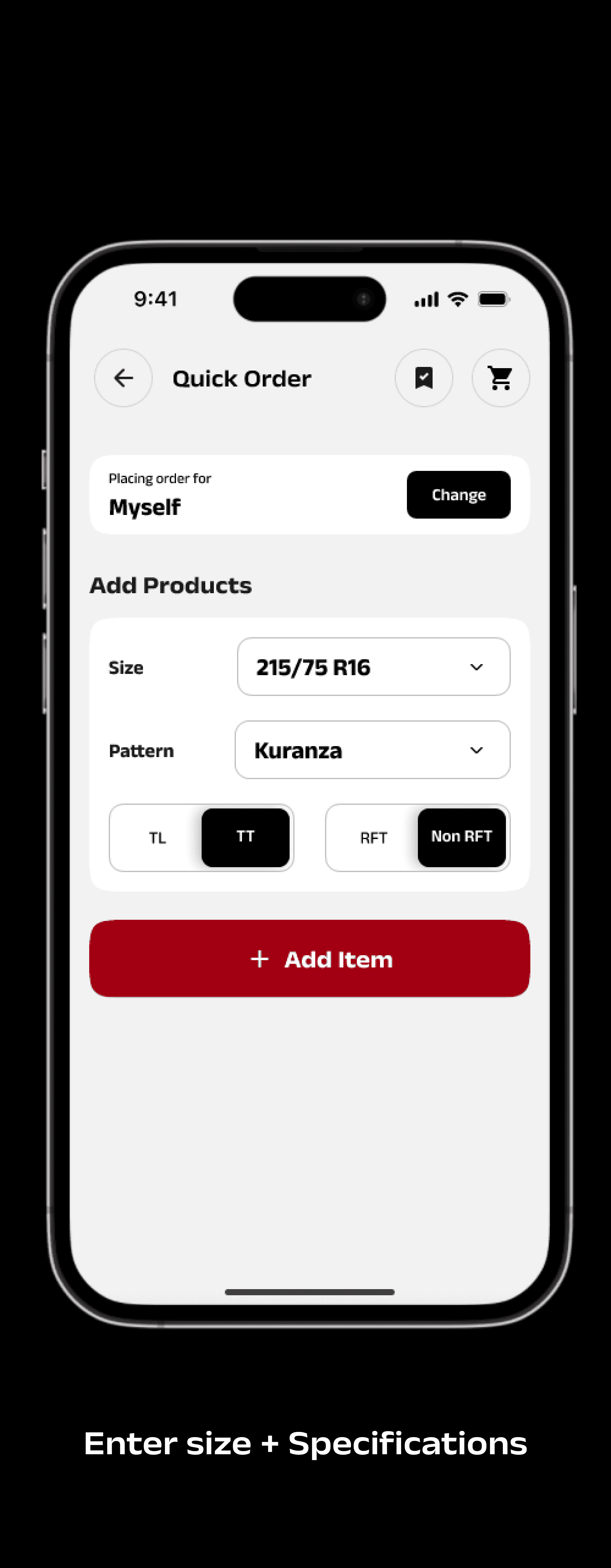
With over 182+ size options, we prioritized a search-first experience.

For those who prefer browsing, the list is arranged in ascending order of tire width to support pattern recognition.

02

02

Select Pattern & Preferences

Dealers often identify products visually before reading names.

We leveraged product illustrations to aid recognition, speed up selection, and reduce reliance on text-heavy UI.

03

03

Enter Quantity
Enter Quantity

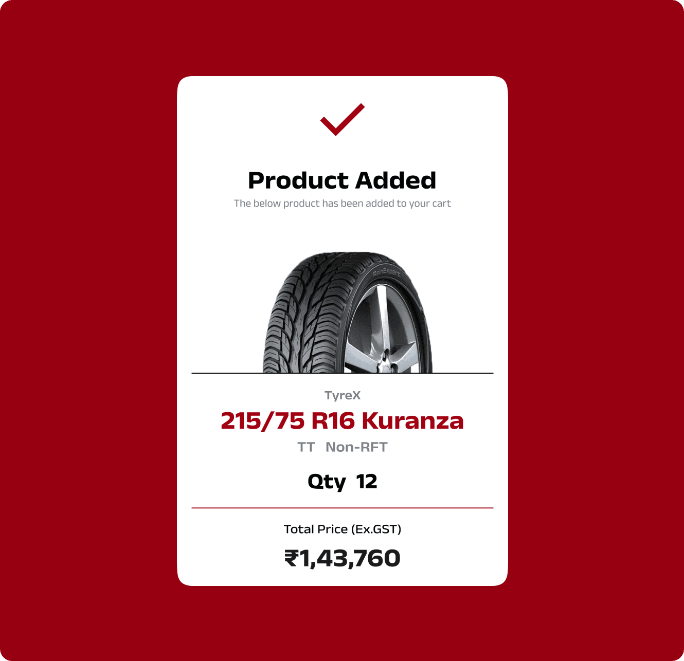
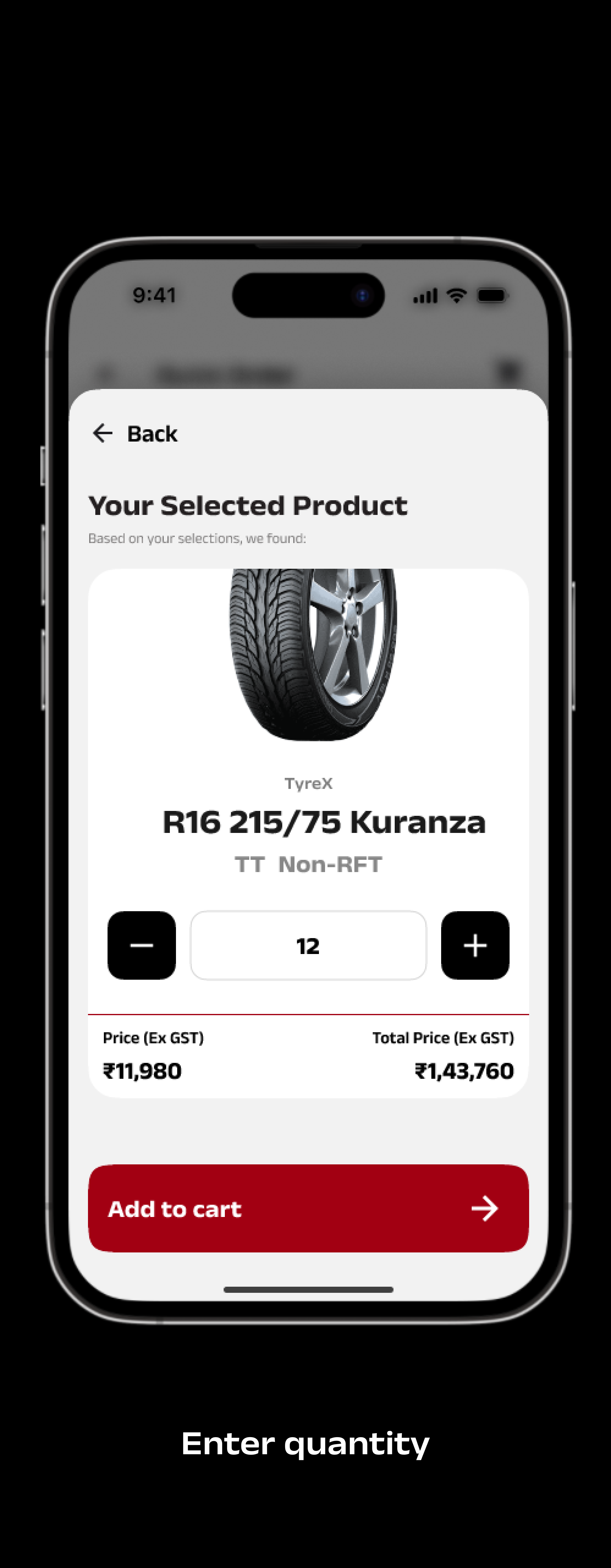
The use of actual product visuals at this step helped reinforce the selection, reducing errors and potential returns.

Dealers could quickly add quantity using a stepper or type it in directly for speed.

04

04

Confirmation
Confirmation

A lightweight confirmation displays:

  • Selected product

  • Quantity

  • Total price

This feedback loop lets dealers quickly verify and maintain control without needing to visit the cart repeatedly.

This feedback loop lets dealers quickly verify and maintain control without needing to visit the cart repeatedly.

Returning to the Cart

01

01

Edit added products
Edit added products

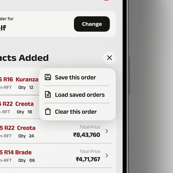
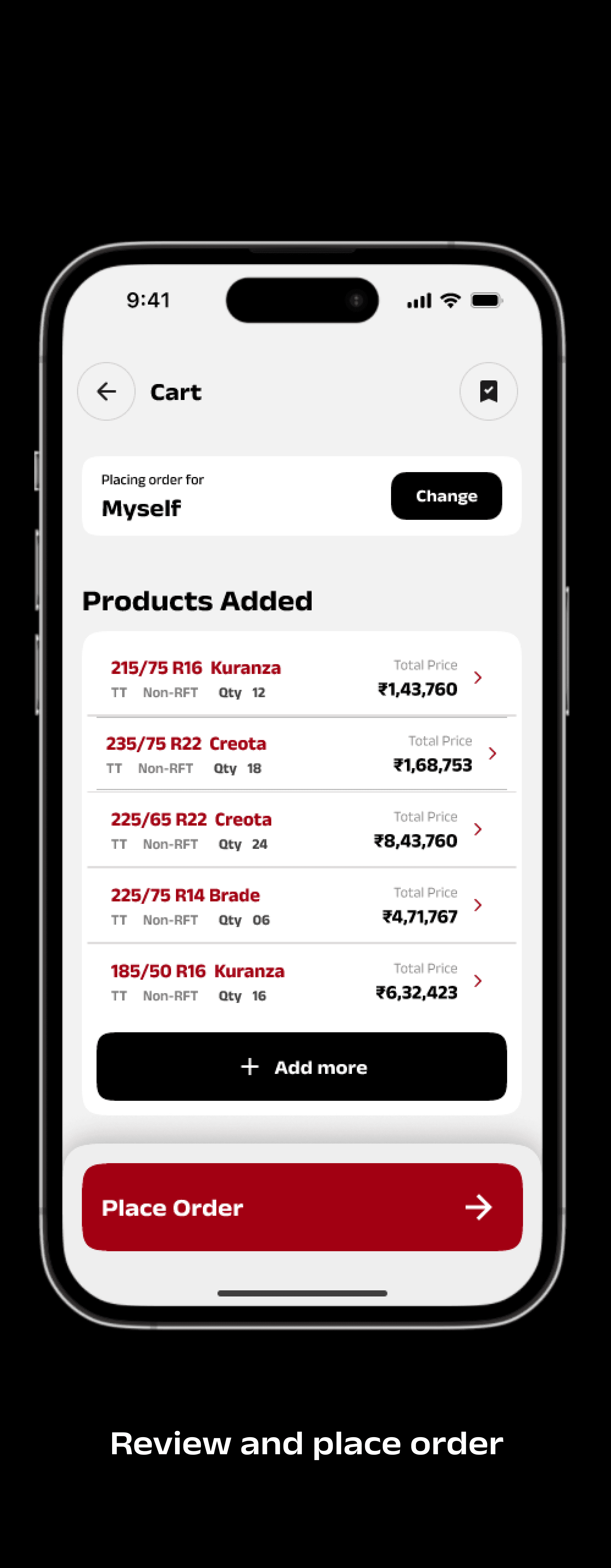
Quick inline editing tools allow users to adjust quantity, change patterns, or remove items before checkout—without disrupting the flow.

02

02

Save/Load Orders
Save/Load Orders

Dealers can:

  • Create a Saved Order for future use

  • Load an existing one to save time on repeat purchases

03

03

Credit Wallet
Credit Wallet

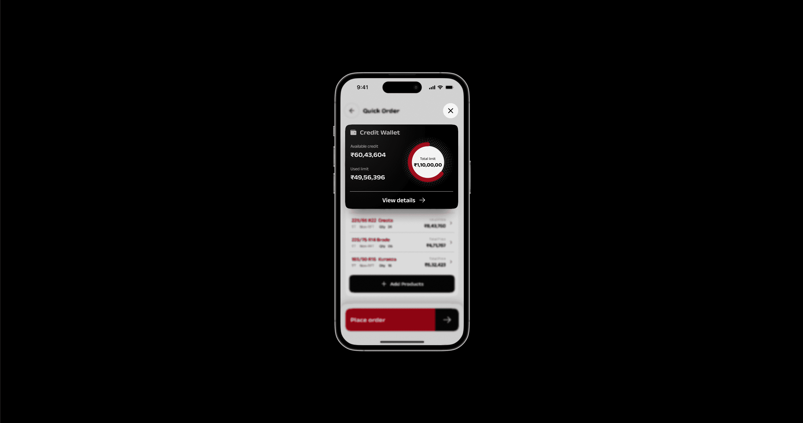
A visible credit summary—pulled from their account—helps dealers make financial decisions in context, without needing to navigate to a different section.

04

04

Review and place order

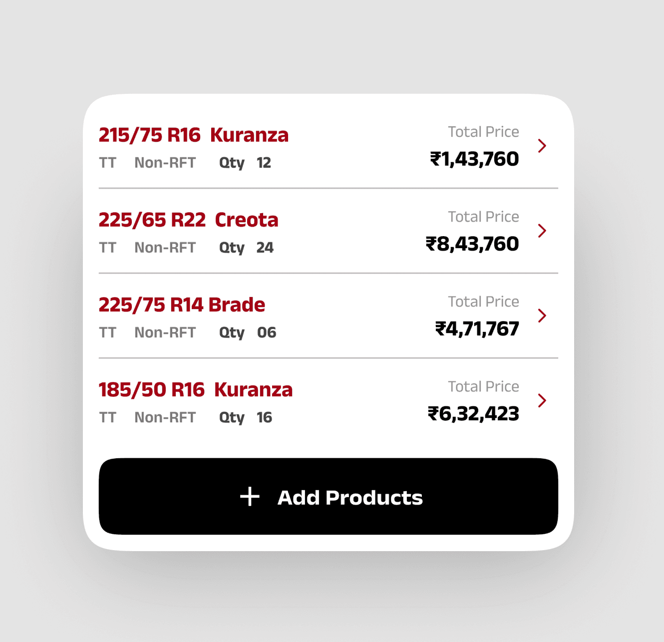
Dealers can now review:

  • Full line items

  • Pricing breakdowns

  • Credit balance

And proceed to place their order with confidence.

05

05

Order Confirmation
Order Confirmation

Upon placing the order, the dealer receives a confirmation screen with Order ID, which they can easily copy and share with sub-dealers or for future reference.

Design Principles at Play

Progressive Disclosure

We minimized cognitive load by only showing what’s necessary at each step.

Constant Visibility

Dealers can always see and manage what’s in their cart.

Supports Dealer Workflow:

The interface mirrors the real-world behavior of building and finalizing a list step-by-step.

Single-Page Flow Feel

The cart and product add experience live in the same interface, eliminating the back-and-forth between pages.

Reduced Friction

By combining add + review into a single space, we reduced complexity while increasing control.

Outcomes
Outcomes

The final Quick Order experience led to measurable improvements in both usability and user satisfaction. By aligning closely with dealer behavior and simplifying the interface, we saw encouraging results post-launch:

The final Quick Order experience led to measurable improvements in both usability and user satisfaction. By aligning closely with dealer behavior and simplifying the interface, we saw encouraging results post-launch:

26%

26%

reduction in time taken to place an average bulk order

reduction in time taken to place an average bulk order

47% increase in Saved Order usage after making it more visible and integrated

+38 NPS score for the Quick Order flow (compared to -4 in the previous version)

Fewer support queries related to repeat orders and credit info

Replicating the "to-order list" to cart was still time consuming

Key learnings
Key learnings

Design for the Expert User

This project reminded me that in B2B workflows, users are often power users who value speed, clarity, and control over aesthetics or exploration. Designing for their efficiency meant minimizing unnecessary UI and honoring their existing mental models.

Real-Time Feedback Builds Confidence

Allowing dealers to see their cart update in real-time without navigating away gave them a strong sense of control and reduced order errors.

Progressive Disclosure Reduces Friction

Showing only the necessary inputs at each step helped reduce overwhelm—especially important when the system has large data sets (like 180+ size options).

Surface Features Based on Context, Not Hierarchy

“Saved Orders” was a useful feature, but it was being missed because it was tucked away. By bringing it forward in the flow where it mattered, adoption increased significantly.

Small Tweaks Can Unlock Large Impact

Adding credit wallet info at checkout—a seemingly small change—helped dealers make faster decisions and reduced their need to check another system mid-order.

That's the end of this case study!

Know more about me

Currently exploring new opportunities

Let's Connect

— Click to copy

— Click to download

Know more about me

Currently exploring new opportunities

Let's Connect

— Click to copy

— Click to download

Know more about me

Currently exploring new opportunities

Let's Connect

— Click to copy

— Click to download

Know more about me

Currently exploring new opportunities

Let's Connect

— Click to copy

— Click to download